 Mikel McCormick
In 60 seconds
I had two projects that each already have a long Case Study inside the app: MySous and the Dad-a-base. This site had to summarise them and link out rather than retell them, let each one’s own look come through, and be a sample of the same way of working itself.
- Stack: Astro 7 with static output, Tailwind v4, TypeScript, MDX for this page. MySous is React and the Dad-a-base is Vue, so this one deliberately uses neither.
- Content: each Project is one YAML file, checked by a Zod schema. Every Project page comes from one template.
- Weight: 660 bytes of the site’s own JavaScript, all of it for the theme, plus Vercel’s analytics. On a phone, Lighthouse scores 100 for accessibility, best practices and SEO on every page, and CI fails a pull request that drops any of them.
- Process: a spec, five decision records, and nine milestones, each a GitHub issue and a pull request with a preview deploy I reviewed before merging, then a round of design changes.
The code is public on GitHub, at magicianmike/portfolio, with the spec, the decision records and every pull request.
Why Astro
a third way
Each piece in this portfolio takes a different approach. MySous is Next.js and React; the Dad-a-base is Vue with Apollo. A portfolio is a content site: a handful of pages, a few images, and almost nothing to click that isn’t a link. That’s what Astro is built for. It renders to plain HTML, and a page ships JavaScript only when it asks for some (ADR 0001).
Styling is Tailwind v4, another way to keep a design consistent after the Dad-a-base’s plain CSS and three token layers. Tailwind’s @theme makes the tokens real CSS variables, so the utilities and any hand-written CSS read the same values. The colours live in one file, and dark mode reassigns them (ADR 0002).
Projects as content
one file each
Each Project is a YAML file in an Astro content collection: its name, pitch, the Margin note beside it on the home page, the problem, my role, the stack, three Highlights, what’s next and its links. A Zod schema checks every file at build time, so a missing field, a misspelt one, or a screenshot without alt text fails the build rather than the page (ADR 0003). Exactly three Highlights are required, so every Project page has the same shape and they’re easy to compare.
The links are only to pages that exist. Until this page was written, the Portfolio site’s Case Study link was left out, and its Project page has no “Live site” link because it would only point at this site.
Screenshots come from a script, not by hand. npm run screenshots opens each live app in Playwright at desktop or phone size, scrolls to what each Highlight is about, and captures it in light and dark. The page shows the one that matches its theme, and the other is never fetched. When MySous’s lime page turned out to carry a “Placeholder image” tag, its Highlight moved to basil; the script made that a one-line change.
The look
chosen, not described
I chose the look from prototypes rather than descriptions. The first round was four home pages, each in light and dark with the real copy and real screenshots:
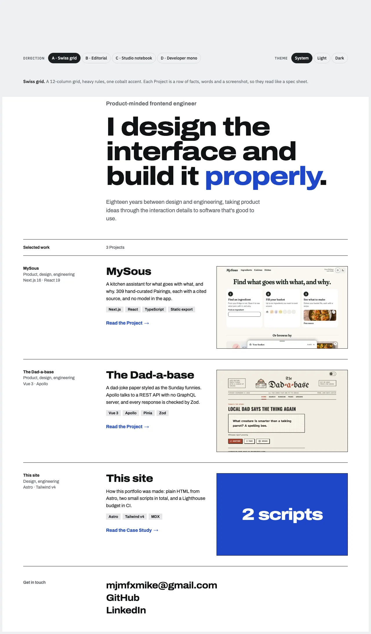
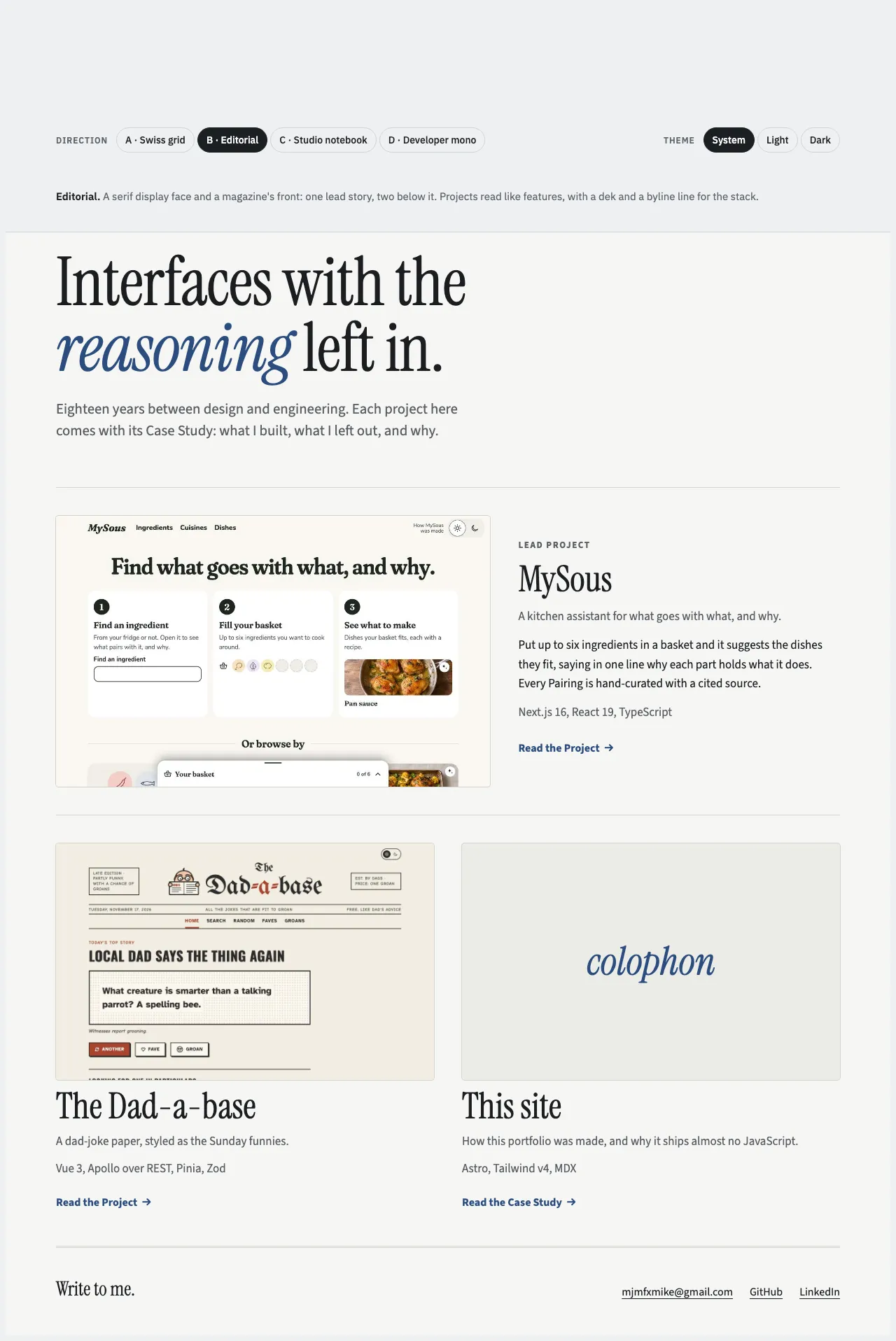
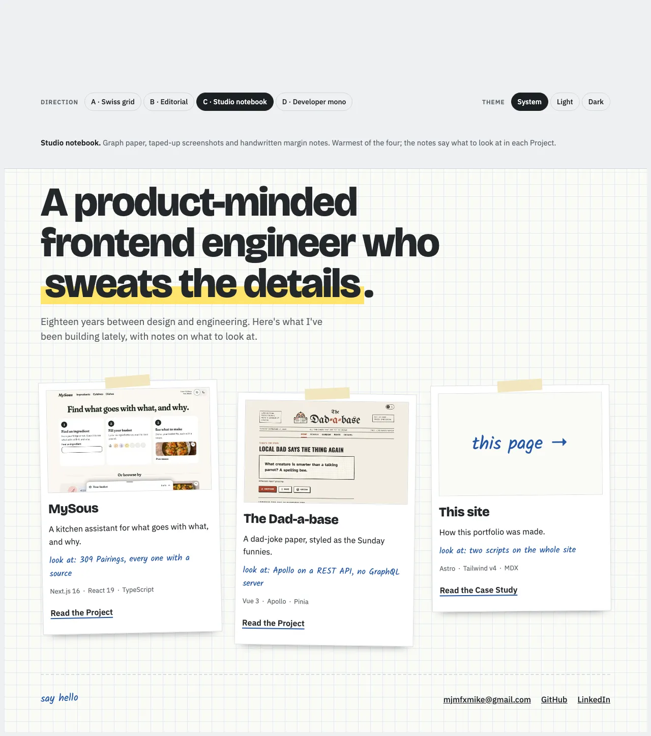
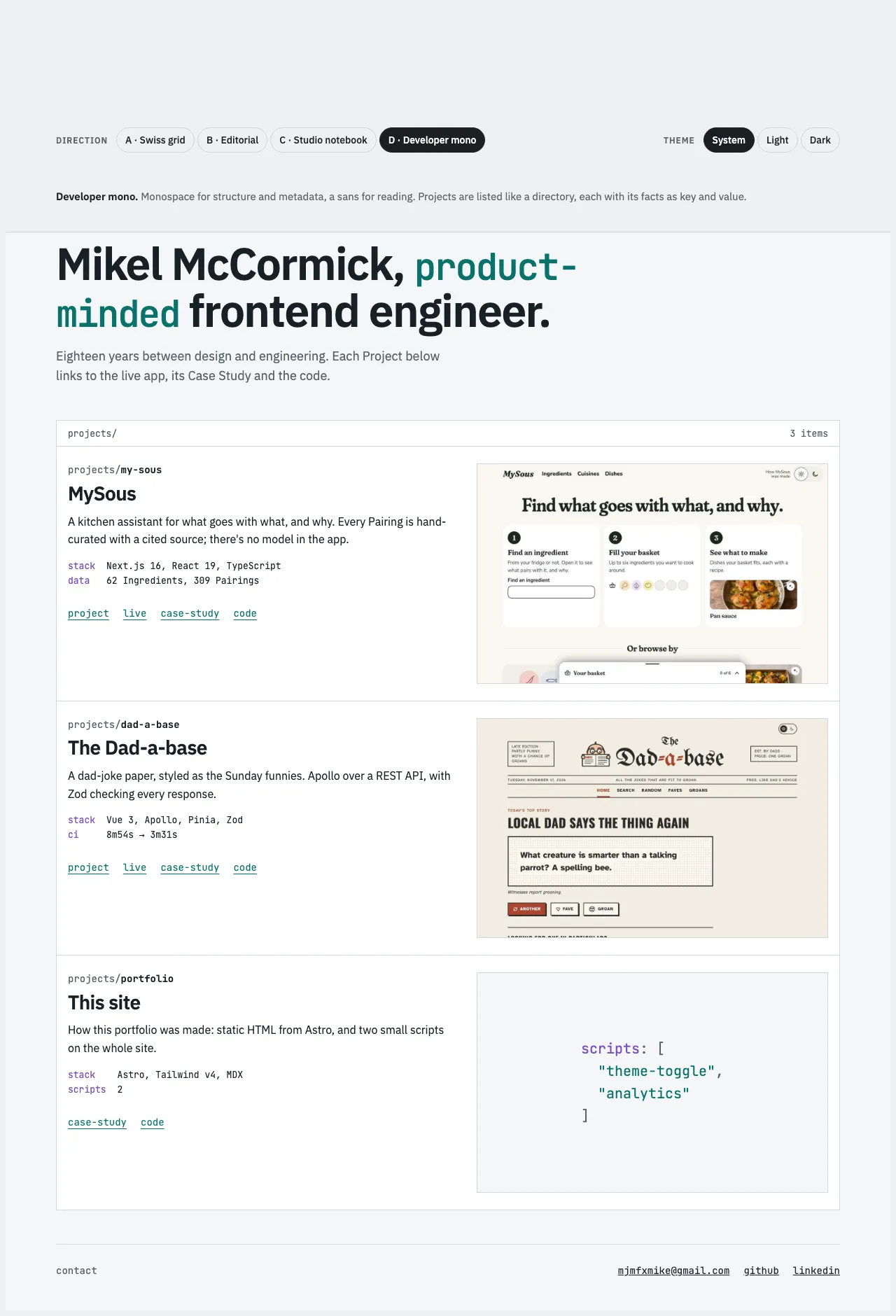
I liked the notebook: its handwriting does a job, telling a reader what to notice in each Project. So the second round was four riffs on it:
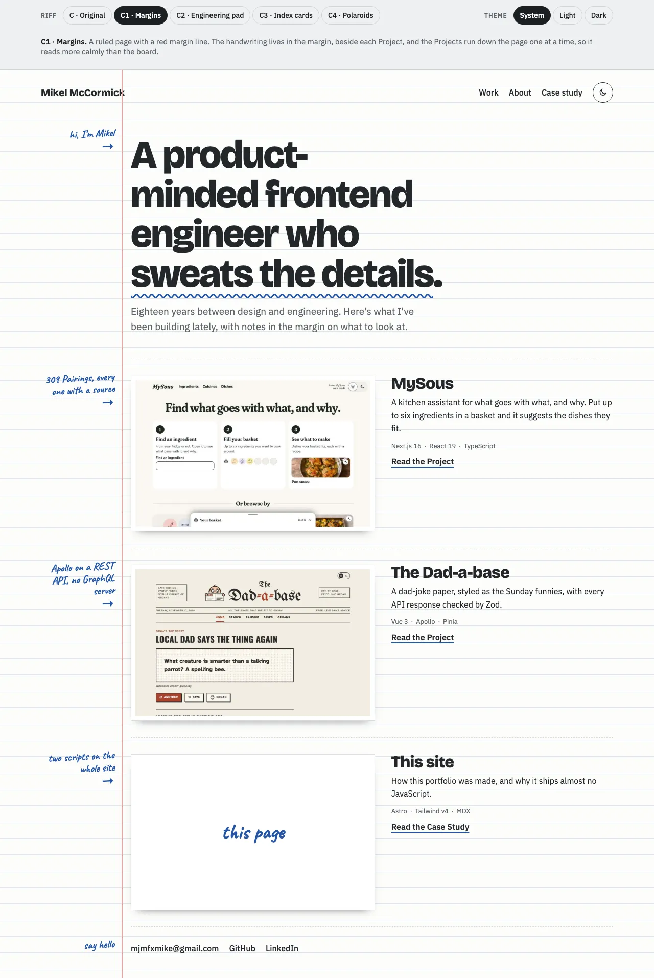
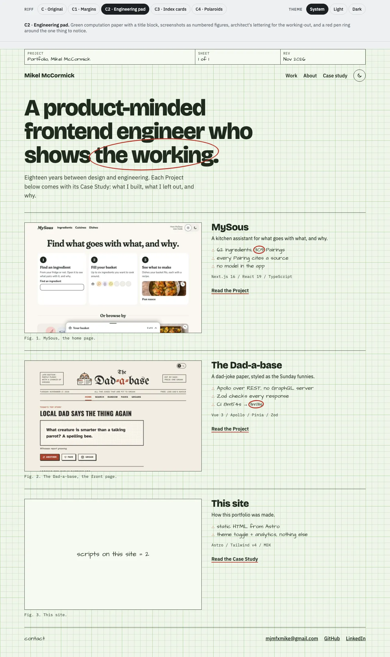
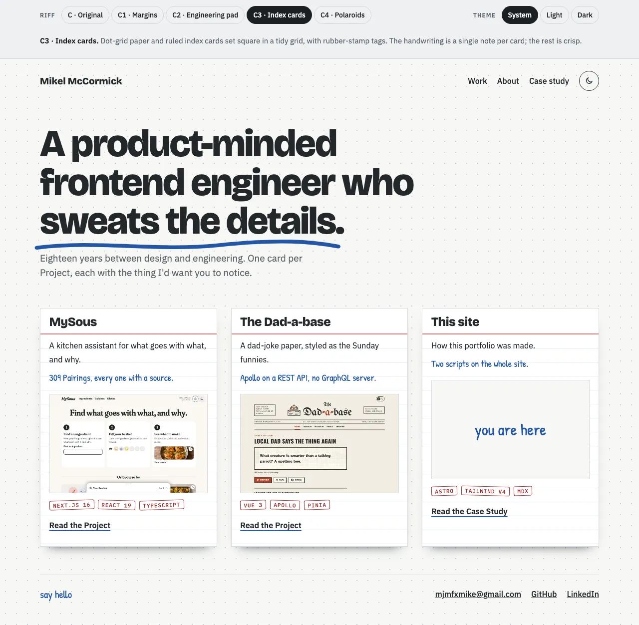
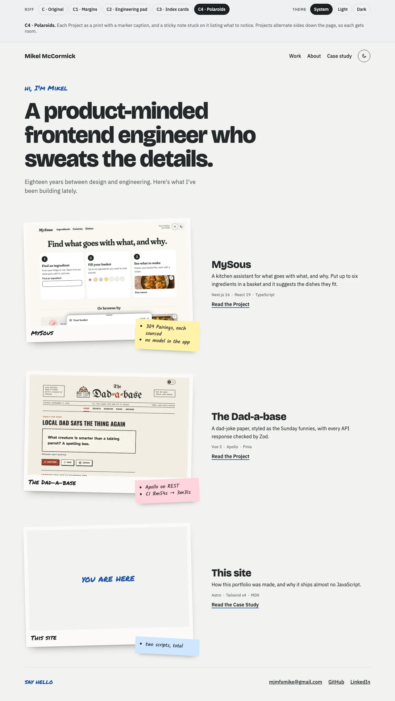
Margins won. It keeps the handwriting but gives it a place, beside what each note is about, and the Projects run down the page one at a time, so it reads calmly and leaves room for each screenshot. On a phone there’s no margin: the red line moves to the edge and each note opens its section instead.
Building it turned up what the prototype hadn’t. The margin line ran through my name in the header, so it now starts below it. On a phone the notes first sat under the previous section’s rule, so they read as its last line; the rule now goes above each note. The fonts are self-hosted at build time, Latin only, so the site makes no requests to a font service.
Performance
660 bytes
The site’s own JavaScript is two small inline scripts for the theme: one in the head applies a remembered theme before the first paint, so the page never flashes the wrong one, and one runs the toggle. Together they’re 660 bytes, 452 gzipped. The only other script is Vercel Web Analytics, which is cookieless, so there’s no consent banner. Unlike MySous and the Dad-a-base, which have no analytics, this site’s job is to be read by people hiring, and it’s worth knowing whether the Case Studies get opened. There are no framework islands (ADR 0004).
Screenshots are the heaviest thing here. astro:assets serves each as WebP at the widths the layout needs, and every one but the first on a page loads lazily.
Lighthouse runs on every pull request, on a phone, three times a page, and CI judges the median run: Accessibility, Best Practices and SEO must be 100 and Performance at least 95, or the pull request fails. The scores when the budget went in, with the Resume page since:
| Page | Performance | Accessibility | Best Practices | SEO |
|---|---|---|---|---|
| Home | 100 | 100 | 100 | 100 |
| About | 100 | 100 | 100 | 100 |
| Resume | 100 | 100 | 100 | 100 |
| This Case Study | 100 | 100 | 100 | 100 |
| Each Project’s page | 98 | 100 | 100 | 100 |
Getting there took two fixes the budget found. The Project pages first scored 90: each fetched its hero screenshot in both themes, and the display face loaded its whole variable range of weights at 131 KB when the site uses one. Now the light hero loads first at high priority and the dark one only when it shows, and each face loads only the weights the site sets. The stylesheet is inlined, so it doesn’t hold up the first paint. Before the budget, production lost 4 points on Best Practices to a missing favicon; it has one now, drawn from the ruled page.
Every page also has its own link preview image, made at build time from the site’s fonts and colours: the page’s title, a line about it, and its Margin note.
Accessibility
checked, every change
WCAG 2.2 AA, in both themes, checked on every pull request:
- axe on every page, in light and dark, in Chromium and in WebKit on an iPhone, after the fonts have loaded, since they’re part of the contrast.
- Contrast is tested from the tokens themselves. A test reads the colour values out of the stylesheet and checks every text colour against every surface, in both themes, so a change of value can’t slip past.
- The theme toggle looks like a switch but is a button named “Dark theme” that says whether it’s pressed. It follows the system until it’s used, and without JavaScript it stays hidden and the page simply follows the system.
- Links that repeat say whose they are. Each Project’s card and page link to its Case Study, live site and code, so their names start with the visible words and then name the Project: “Case Study: MySous”. A screen reader’s list of links has no two the same, and speech input can still say what it sees. On a card, a link to another site opens in a new tab, and its name ends “(opens in a new tab)”.
- A skip link is the first stop on every page, and the navigation marks the page you’re on.
One catch came from the tooling, not a rule: Tailwind’s reset takes the underline off every link, and milestone 1 shipped footer links that looked like plain text. Links are underlined by default again.
Building with Claude
I steer, Claude builds
I built this with Claude Code. It started with a grilling: Claude asked me questions in rounds until the spec had no open decisions in it, from who the site is for down to the Vercel address. Then each milestone went the same way: an issue, a branch, Claude building to the spec and the rules in CLAUDE.md, screenshots it looked at and fixed from, a pull request, CI, a preview deploy, and my review before I merged.
The rules say Claude asks before anything outward-facing: every push, issue and pull request. The decisions stayed mine, including some it had to ask about, like leaving my phone number out of the resume. The PDF to download is printed from the resume’s own page, which has no phone number on it, and a test checks that no page shows one.
After launch
two more, and a round
Once the first seven milestones were in, two more followed, then a round of design changes.
- About gained a photo, taped into the page like a print, and a section on life outside of work. The same photo is the small avatar beside my name in every header. Its metadata is stripped before it’s committed.
- The resume got a page of its own, word for word from the HTML resume I keep elsewhere, and in its layout: the black bar, the spaced-out labels, the striped rows. It’s in this site’s fonts, on a sheet taped into the notebook, with colour tokens of its own. The original’s lightest grey fails 4.5:1, so here it’s a shade darker. The PDF to download is printed from that page, whose print styles leave only the sheet, so the two can’t drift apart.
- The Project cards link straight to each Project’s Case Study, live site and code, each with an icon.
- The theme toggle borrows the Dad-a-base’s switch: both the sun and the moon show, and a thumb slides behind the one in use. Its script didn’t change, so the 660 bytes still stand.
Found on the way
- Astro backgrounds its preview server when it detects a coding agent, so Playwright’s server “exited early”. A flag keeps it in the foreground.
- CI spent five minutes installing browsers for seven seconds of tests. The Playwright jobs now run in Playwright’s own container, pinned to the same version, and take under two minutes.
- iCloud Drive syncs the folder the repository lives in, and made duplicate copies of files mid-build. Each was checked against the history before it was removed.
- A test raced the lazy images in WebKit on CI. It now scrolls each into view and waits for it to load.
- A dev server on the tests’ port made Playwright test it instead of the build, and fail on the sitemap, which only a build makes. The tests now have a port of their own.
What’s next
- More Projects, which the content collection makes one file each.
- A pass over the copy once the analytics say which pages get read.